Wilkinson Sword Quattro for Women (Bikini Edition) is a new razor for women to shave their bikini line for the up coming bathing suit season. JWT, a New York ad agency has created a UK campaign called “Mow the Lawn” with a very humorous take on the product. I think that the commercial is unique and it will guarantee a fair amount of buzz for the product. However, if it is released in the US you can be certain it is going to cause some serious shit.
Concept Packaging
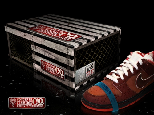
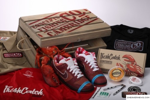
You could say that I am a bit of a shoe-head, and I have modest collection of rare Nike shoes. It is not a large collection but I would say that I buy with an editing eye, and always enjoy the small details that go into collector shoes. To combined a great pair of kicks with excellent packaging is a very enjoyable experience for all shoe shoppers, and it adds that extra incentive every once in awhile if you are sitting on the proverbial fence. Well I was browsing through The Dieline and came across this amazing packaging for the Nike ‘Lobster Edition’ shoe. The detail in the shoes are awesome, from the table cloth pattern on the inside, to the rubber band claw holders at the top of the shoe. The shoe box design is just amazing, and what an awesome idea. It helps that it is paired with some top-notch photography, but I would have to say that the packaging would seal the deal for me.
My apologies for not posting yesterday. I am definitely in full mode “crunch time” at school.
Filed under 1
Sheep Art
My sister sent this YouTube video to me this morning, and I thought it was worth a post. It’s pretty great when a marketing team can put something original together and not just use the same old idea over and over. It reminds me of the clever T-mobile Dance ad.
Where the Wild Things Are > Movie
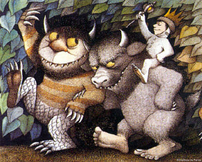
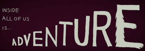
So today I was enlightened with some fantastic news, one of my all time favorite childhood books is being made into a motion picture. This October ‘Where the Wild Things Are’ is going the hit the big screen and I will be there with tin foil crown and scepter in hand. At first you will probably have the same reaction I had, “please don’t screw up this classic, and please tell me Michael Bay has a restraining order against the script.” Well it turns out that it couldn’t get any better with the combination of Maurice Sendak as author, Spike Jonze as director, and throw in a little Arcade Fire as the cherry on top. On top of that outstanding team, the cast of voices include: Forest Whitaker, James Gandolfini, and Catherine O’Hara. After watching the trailer you will notice also how great the title credits and title sequence typography is with its hand-drawn characters. So it is time to dust off your copy of ‘Where the Wild Things Are’ and give it a good read, and if you have kids introduce them to the amazing illustrations before they feast their eyes on the big screen.
-Big thanks to Nick for letting me know of this stupendous news-
Filed under 1
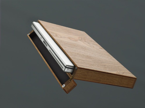
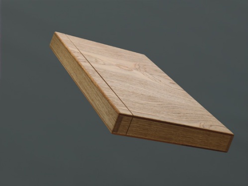
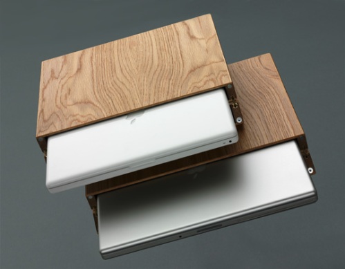
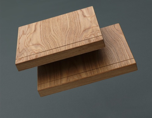
Wooden Wonder
Rainer Spehl’s has designed a solid redwood laptop case with a soft leather lining. Not only does the leather provide a perfect fit, but prevents any type of scratching. There are two magnetic device locks that snap into place to keep the case closed while you zip about town. These babies are hand-crafted in Germany and you will pay for it too at $350 CAD.
Filed under 1
1800 Tequila > Artist Series
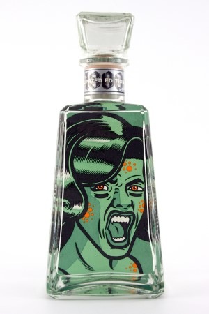
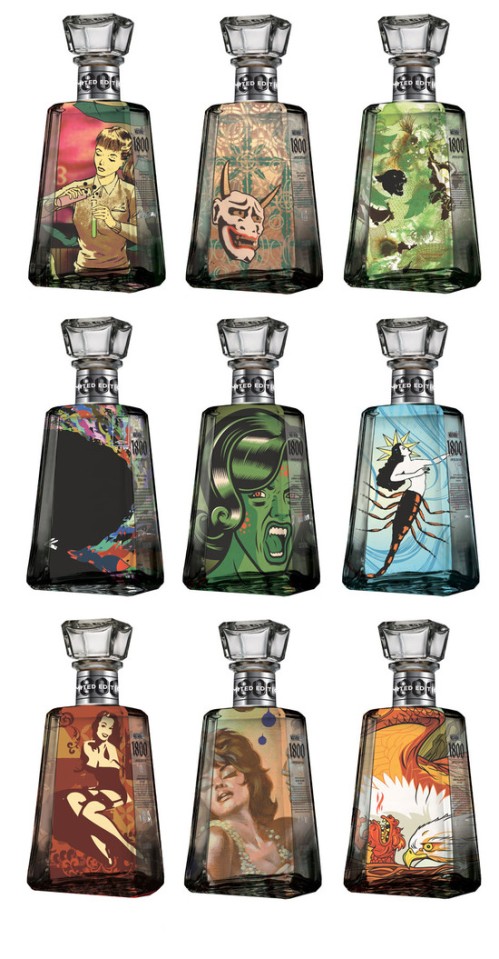
I was browsing through one of the many stacks of magazines I have sitting around and came upon a article highlighting the new 1800 Tequila artist series bottles. ” This limited edition designer series by 1800 Tequila seeks 1800 artists from all disciplines to showcase their vision via a very non-traditional medium.” Within the website you can design your very own tequila bottle, and take a look at the bottles that have already been produced. The one that really caught my eye was by Jorge Alderete from Mexico City. I am really liking that zombie girl, and his style. You should take a scroll through his work and check out some really awesome illustrations.
(source: elemente magazine)
Filed under 1
HBC logo
I have always had a problem with the HBC logo with the black box and twisting 4-colour strips. Whenever I would go into The Bay I would look at the logo with confusion, and fail to see how that connects with the history and culture of The Hudson’s Bay Company. You would assume that a company that was founded almost 340 years ago would want to show their deep heritage to their customers. Well, the new logo may not be perfect to everyone but it is such a drastic improvement that I have nothing negative to say about it. The new logo feels Canadian, and it denotes some sort of history that the pervious logo did not achieve. The new logo says “Canada” and the old says “HBC, colourful shoelaces.”

Filed under 1
Vampire News
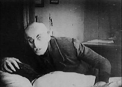
Even though this post is not design related I had to throw it up there because it is just so interesting. This week in Venice a skeleton was found with a brick in its mouth and is being claimed as the first known example of “vampire” remains. You got to read this article, and then go and watch F.W. Murnau’s German silent Nosferatu. Just make sure you have some garlic and a healthy stack of wooden stakes.

Filed under 1
Eye Grow Update
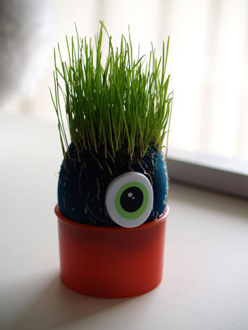
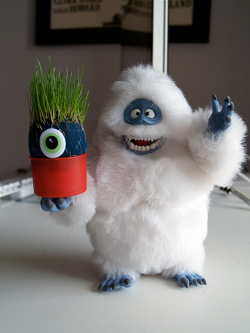
Well the first week results are in on the Eye Grow, and they are surprising. This little bugger grew like a weed after 5 days of germination. The grass is rich and green, and it is almost time for his first grass cut. He sits on my desk and has made a new friend in Bumble. To my surprise the Eye Grow balances perfectly in Bumble’s hand. Amazing.
Come back tomorrow for even more enlightening information.
(not about the Eye Grow)
Filed under 1
Jeremy Fish Studio Visit
Jeremy Fish is an illustrator currently living in San Francisco. This past fall Jeremy had a show titled “Ghosts of the Barbary Coast” and was displayed at the Fifty24SF gallery. In this interview by Fecal Face Jeremy gives insight into the inspiration for his work, and the interesting history of San Francisco.
(Jeremy’s site. Unfortunately the site is down for now, but bookmark it!)
Filed under 1
